
If you like your video game stories, then read on! I just got back from a conference that inspired me to make a data graphic with some of the most celebrated video game RPGs in the modern era. – Josh
Tableau is incredibly robust and my experience at TC17 in Las Vegas showed me just how much so. My visualizations has always focused on designing for the interactive experience, and with the #data17 knowledge I acquired, I was able to merge many ideas into a more fully realized data-driven experience with my work.
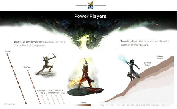
There’s a data set that I picked up in the spring and worked on but then abandoned because I didn’t feel like the story I was building did justice to the subject I was passionate about: role-playing video games.
Role-playing games (RPGs) stand as giants in the world of video games. The level of immersion when playing these games is remarkable and your connection to the characters and story is much more palpable because in a sense the player controls his or her own destiny in the game.
In my Tableau work, I wanted to convey some of the impact and meaning behind these creations and help people more fully appreciate and explore video games as vehicles for art.
I was inspired by the amazing viz work of Jonni Walker to attempt this approach. He arguably sets the bar for beautiful data stories in Tableau and stretches the limits of the software’s capabilities.
There were some tradeoffs I had to make so that the dashboard retained its interactivity and the images could still play a key role in pulling the audience through the story. This was a remarkable experience building on my background in photography and writing in order to create a data-driven story.

Here are some quick tips I learned:
- Photo selection: Fortunately I could use the data set itself to leverage striking images of the game art. I picked images that lent an editorial message to the elements or integrated into the design of the dashboard. (I had a good conversation with Michael Mixon and we commiserated on how long it takes to find the perfect image!) Also, this viz is a type of commentary and the artwork falls under fair use.
- Photo editing: Learn Photoshop or a similar program that offers image masking. Tableau doesn’t offer transparent backgrounds for its charts, so I had to make design decisions that ensured optimal use of interactivity and images. This was a big pain point in Tableau and took probably 3x longer than building out the charts.
- Calculated Fields (including LODs): This is an acknowledgement that your work will go much faster and you’ll be able to approach these type of data-driven stories if you learn how to present your data using calculated fields.
- 3000 pixels tall!: Everything floated and it was beautiful. Just keep track of all your assets on the dashboard. I did this visually since the Item Hierarchy pane still isn’t that intuitive to me.
- Pay it forward: I was tempted, right up until this writing, not to share the downloadable file. But I have learned so much from the Tableau Public community and would not be where I am without its members and their generosity (there are so many, I can’t name them all!). I think there’s a social contract of sorts, not necessarily in always making your work available, but in making a real effort to share knowledge and elevate the whole community.
I hope you enjoy. Happy vizzing!
